Đây là bài viết của tôi về cách sử dụng R trong ứng dụng Genetic Algorithm trong Supply Chain
1 Giới thiệu:
1.1 Vài điểm về thuật toán Genetic:
GA hay Genetic Algorithm là 1 thuật toán tối ưu hóa ngẫu nhiên (stochastic search algorithms), được phát triển dựa trên lý thuyết tiến hóa và sự chọn lọc tự nhiên của sinh học (Luca Scrucca 2013).
Ở thời cấp 3, bạn đã từng học về lý thuyết tiến hóa và chọn lọc tự nhiên của Charles Darwin và Alfred Russel ở môn Sinh học. Nếu bạn cũng từng liệt Sinh như tôi thì bạn quên cũng không sao 😅😅. Vậy thì để tôi giải thích lại như sau:
Sự tiến hóa là sự thay đổi đặc điểm di truyền của 1 quần thể sinh vật, ví dụ điển hình chính là từ loại vượn đã tiến hóa thành hình dạng con người văn minh như các bạn bây giờ. Vậy quá trình tiến hóa đó diễn ra khi có sự chọn lọc tự nhiên tạo ra các biến dị di truyền (Ví dụ: đột biến,…) và kết quả là các cá thể đột biến trở nên phổ biến hơn hoặc hiếm gặp hơn trong quần thể. Vậy điều kiện để xảy ra sự chọn lọc tự nhiên có thể là sự thay đổi về môi trường sống, địa lý,… dẫn tới sự khác nhau về khả năng sống sót và sinh sản.
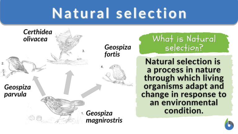
Kết cục là xuất hiện các cá thể đột biến “mạnh mẽ hơn” hoặc đúng là “đặc biệt hơn” có khả năng tồn tại khi xuất hiện sự thay đổi lớn, ví dụ như dưới đây, do sự thay đổi về địa điểm sống, từ một loại chim sẻ đã phát triển thành 3 phân họ khác nhau.
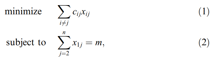
Vậy lí thuyết này liên quan gì tới vấn đề tối ưu hóa. Thông thường khi bạn muốn tối ưu hóa một vấn đề gì đó, bạn cần xây dựng mô hình định lượng nó, ví dụ như dưới ảnh này ta đang có mô hình MILP nhằm hoạch định tuyến đường và tối ưu hóa quãng đường di chuyển.
Mục tiêu của hàm chính là tìm ra giá trị nhỏ nhất nghĩa là chi phí cho việc di chuyển của xe là nhỏ nhất. Do đó, bạn có thể hình dung rằng giá trị nhỏ nhất đó như là các cá thể đột biến có khả năng sống sót cao nhất trong quẩn thể.
Vì vậy thuật toán Genetic (GA) chính là lặp đi lặp lại sự chọn lọc tự nhiên trong một quần thể hoặc một mẫu để đến cuối cùng tìm ra cá thể vượt trội nhất.
1.2 Cách hoạt động GA trong ML:
Trong Machine Learning, GA nhằm tìm ra đúng các biến cần thiết để xây dựng mô hình tốt nhất. Gỉa sử chúng ta có 2 mô hình là:
Mô hình 1: gồm các biến A,C,D.
Mô hình 2: gồm biến A,B,E.
Vậy mô hình nào mới là tốt nhất cho mô hình dự đoán ? Chúng ta chưa biết được và chỉ có thể so sánh nó thông qua thuật toán Genetic.
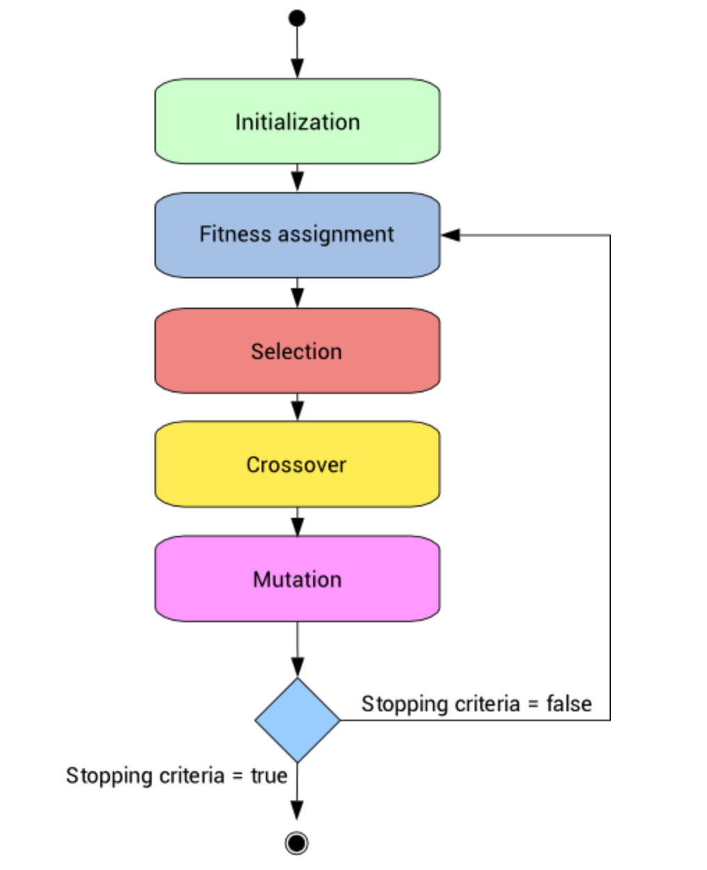
Về quy trình, thuật toán Genetic sẽ có cách hoạt động như dưới đây. Quy trình này mình tham khảo của (Rohith Gandhi 2018).
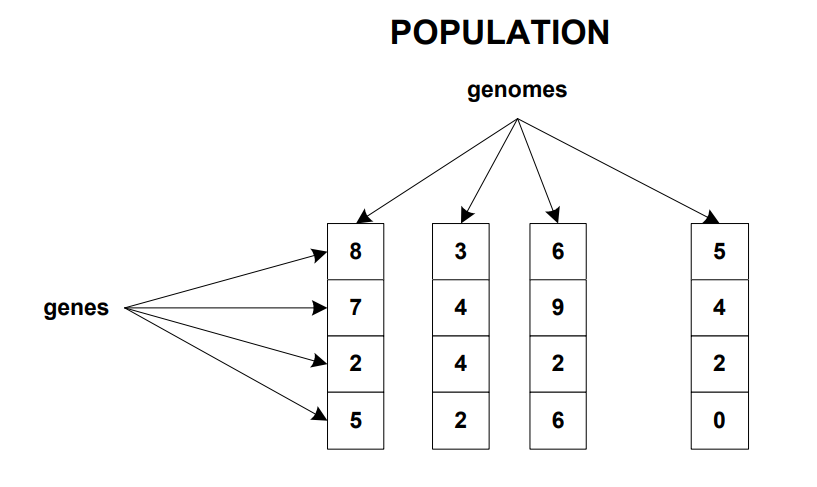
Bước 1 (Initialisation): mỗi biến được xem là Gene và nhiều Gene gộp lại thành một mô hình hay gọi là Chromosome và nhiều Chromosome sẽ tạo thành một quần thể (Population). Việc này giống như là bạn đang trình bày hết các phương án có thể sử dụng.
Bước 2 (Fitness Function): Bạn cần xây dựng một hàm mục tiêu để tính toán giá trị cho các mô hình ở bước 1.
Bước 3 (Selection): Biến nào có giá trị yếu kém sẽ bị loại và quá trình tính toán sẽ tiếp tục ở thế hệ của nó tiếp theo. Diễn giải đơn giản hơn là chúng ta thử một cách khác và cố gắng cải thiện kết quả.
Bước 4 (Crossover): Tạo ra mô hình gồm các biến tốt đã lựa chọn ở bước 3. Ví dụ như biến A, B là tốt cho mô hình.
Bước 5 (Mutation): Thay đổi mô hình đầu vào đã bao gồm các biến ở bước 4 và bắt đầu lại từ bước 1. Ví dụ mô hình cần chọn gồm 5 biến và ta đã chọn được biến A,B là tốt. Do đó, khi quay lại bước 1, ta chỉ cần chọn thêm 3 biến thay vì 5 biến như thông thường.
2 Thực hành trong R:
Sau khi đã sơ lược về thuật toán, bây giờ ta sẽ vào phần thực hành trong R. Vậy làm sao để ứng dụng thuật toán Genetic trong R, mình đã kham khảo qua nhiều nguồn tài liệu và tổng hợp dưới đây:
Xây dựng hàm mục tiêu: hàm mục tiêu là bước quan trọng nhất trong thuật toán Genetic vì nó là cơ sở để đánh giá và lựa chọn cá thể vượt trội nhất. Và hàm mục tiêu sẽ luôn khác nhau tùy vào vấn đề mà ta đặt ra. Giả sử chúng ta muốn tối ưu chi phí thì nó là hàm Min, còn ta muốn tối đa lợi nhuận thì nó sẽ là hàm Max.
Vậy hàm mục tiêu của bài toán trên trong R, bạn có thể tham khảo phần code bên dưới mình:
Type of fitness function
Đối số type trong hàm có 3 giá trị:
"binary": đại diện cho biến quyết định dạng phân loại, ví dụ: có/không
"real-valued": dùng dể tối ưu cho các biến quyết định là dạng số thực, số tự nhiên.
"permutation": cho các vấn đề liên quan đến việc sắp xếp lại các biến thành danh sách, ví dụ: thang đo Likert.
Chi tiết về hàm ga(), bạn có thể tham khảo tài liệu của (Luca Scrucca 2013).
2.1 Thuật toán Genetic:
Vậy bây giờ chúng ta sẽ xử lí bài toán trên theo thuật toán Genetic
Gỉa sử chúng ta có bài toán về vận chuyển hàng từ nhà kho để thỏa mãn nhu cầu ở các điểm DC (Distribution center). Và công thức để tính toán được chi phí là:
Trong bài toán này, bạn sẽ cần dữ liệu để tính toán 2 thông số là: Phí bốc xếp (Loading cost) và Chi phí vận chuyển (Transportation cost).
Nếu trong công việc thường ngày ở công ty, chúng ta sẽ cần lấy dữ liệu từ Data warehouse bằng SQL hoặc các phần mềm Business Intelligence khác. Ở đây, nhằm mục đích học tập, mình đã tạo ra code ở phía dưới để xây dựng dữ liệu cho các bạn luyện tập.
Code
# Create a data frame for loading costsloading_costs <-data.frame(Warehouse =rep(paste("WH", 1:5), each =4),ID =rep(1:5, times =4),Weight_Category =rep(c("< 2 tons", "2 to 5 tons", "5 to 10 tons", "> 10 tons"), times =5),Has_Machine =rep(c("Yes", "No", "Yes", "No", "No"), each =4),Loading_Cost =c(80, 100, 120, 160, # Warehouse 1 (with machine)110, 150, 180, 210, # Warehouse 2 (without machine)85, 105, 125, 140, # Warehouse 3 (with machine)150, 170, 190, 210, # Warehouse 4 (without machine)140, 165, 185, 215) # Warehouse 5 (without machine))# Set seed for reproducibilityset.seed(123)# Define parametersweight_categories <-c("< 1.5", "1.5 to 2.5", "2.5 to 5", "5 to 10", "> 10")# Create the data frameloading_costs <-data.frame(Warehouse =rep(1:5, each =15), # 5 warehouses, 15 rows eachDC =rep(rep(1:3, each =5), times =5), # Repeat 1, 2, 3 for each warehouseWeight_Category =rep(weight_categories, times =15), # Repeat categories for 15 rowsLoading_Cost =round(runif(75, 5, 150), 2),Has_Machine =sample(c("Yes", "No"), 75, replace =TRUE))# Define warehouses with coordinates (latitude, longitude)warehouses <-data.frame(ID =1:5,Latitude =c(21.0285, 16.0545, 10.7769, 14.0583, 19.8060), # Example latitudes (Hanoi, HCMC, Da Nang, etc.)Longitude =c(105.804, 108.2022, 106.6957, 108.2772, 105.7460) # Example longitudes)# Define distribution centers data in Vietnam (example coordinates)distribution_centers <-data.frame(ID =1:3,Demand =c(90, 30, 150),Latitude =c(17.974855, 11.7769, 15.122327), # Example latitudes (Hanoi, Da Nang, HCMC)Longitude =c(102.630867, 106.6957, 108.799357) # Example longitudes)
Nếu bạn từng gặp khó khăn trong việc phải đối mặt với cả đống dữ liệu từ hệ thống và chưa biết lấy dữ liệu nào để phân tích hoặc gộp bảng nào qua bảng nào thì lời khuyên của mình là hãy vẽ bảng Entity relation diagram (ERD).
ERD là một công cụ trực quan dùng để mô tả cấu trúc dữ liệu trong cơ sở dữ liệu. ERD thể hiện các thực thể (entities), thuộc tính (attributes), và các mối quan hệ (relationships) giữa chúng. Các thực thể thường được biểu diễn dưới dạng hình chữ nhật, thuộc tính dưới dạng hình ellips, và mối quan hệ bằng hình thoi hoặc đường nối. ERD giúp lập kế hoạch cho thiết kế cơ sở dữ liệu, đảm bảo rằng các yếu tố dữ liệu và quan hệ giữa chúng được xác định rõ ràng, tạo nền tảng cho việc phát triển và quản lý dữ liệu hiệu quả.
Như biểu đồ dưới đây, mình đang có 3 bảng gồm:
Bảng thông tin chi tiết về DC.
Bảng thông tin chi tiết về WH.
Bảng giá về loading cost và transportation cost từ WH đến DC.
Và các bạn có thể dễ dàng hình dung các mối quan hệ thông qua bảng Entity relation diagram (ERD) dưới đây:
Biểu đồ 1: EDR model
Tải package datamodelr:
Mình tạo biểu đồ này bằng thư viện datamodelr. Bạn có thể tải bằng cú pháp: devtools::install_github("bergant/datamodelr")
2.1.1 Dữ liệu đầu vào:
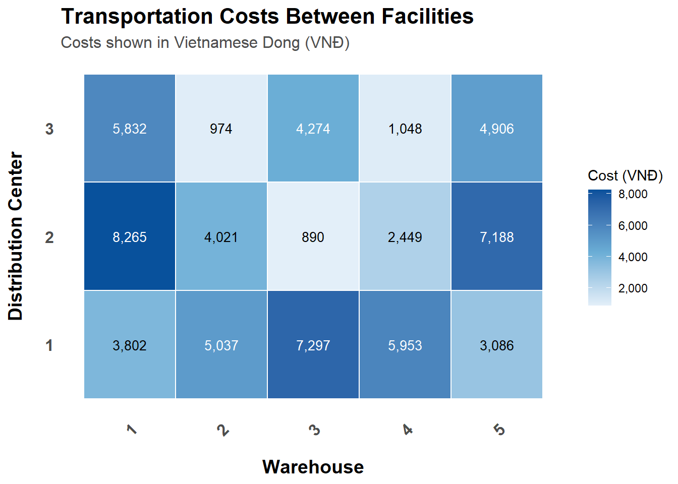
Như vậy, dựa vào đó, ta sẽ tính toán được 2 matrix về chi phí:
Bảng giá loading ở các kho. (Hình bên trái)
Bảng chi phí vận chuyển từ từng WH đến các DCs. (Hình bên phải)
Code
## Calculate the transportation cost:# Haversine distance functionhaversine <-function(lat1, lon1, lat2, lon2) { R <-6371# Radius of Earth in kilometers dlat <- (lat2 - lat1) * pi /180 dlon <- (lon2 - lon1) * pi /180 a <-sin(dlat /2) *sin(dlat /2) +cos(lat1 * pi /180) *cos(lat2 * pi /180) *sin(dlon /2) *sin(dlon /2) c <-2*atan2(sqrt(a), sqrt(1- a)) R * c # Distance in kilometers}# Calculate distance matrix based on coordinatesdistance_matrix <-matrix(0, nrow =nrow(warehouses), ncol =nrow(distribution_centers))for (i in1:nrow(warehouses)) {for (j in1:nrow(distribution_centers)) { distance_matrix[i, j] <-haversine( warehouses$Latitude[i], warehouses$Longitude[i], distribution_centers$Latitude[j], distribution_centers$Longitude[j] ) }}# Define the fuel price (example value)fuel_price <-20# Fuel price per kilometer# Calculate transportation coststransportation_costs <- distance_matrix * fuel_price *0.4## Calculate the loading cost:weights_per_good <-0.1mean_loading_cost<-loading_costs |>group_by(DC, Warehouse) |>summarise(mean =mean(Loading_Cost,na.rm =TRUE)/1000/weights_per_good) |># Assumes weighted of goods is 0.1kg ungroup()library(data.table)# Reshape the data frame to a wide formatmean_cost_matrix <- reshape2::dcast(mean_loading_cost, Warehouse ~ DC, value.var ="mean")# Convert the data frame to a matrix and remove the Warehouse columnloading_costs_per_dc <-as.matrix(mean_cost_matrix[,-1])# Set row names as the warehouse namesrownames(loading_costs_per_dc) <- mean_loading_cost$Warehouse[!duplicated(mean_loading_cost$Warehouse)]
Loading Costs by weight category in each warehouses
Table just contains expected loading cost
Warehouse
Distribution Center
Weight Category
Loading Cost (VNĐ)
Has Machine
WH 2
DC 2
5 to 10
₫149,170
Yes
WH 3
DC 1
< 1.5
₫144,640
No
WH 1
DC 3
< 1.5
₫143,740
No
WH 2
DC 1
> 10
₫143,400
No
WH 1
DC 1
> 10
₫141,370
No
WH 3
DC 1
1.5 to 2.5
₫135,830
Yes
Source: package gt in R
Biểu đồ 3: Bảng giá vận chuyển từ WH đến DC
2.1.2 Xây dựng hàm mục tiêu:
Sau khi đã có đủ dữ liệu, bạn sẽ bắt đầu viết hàm mục tiêu và dùng thuật toán GA để tìm ra giá trị tối ưu nhất.
Trong hàm ga từ gói GA trong R, có một số đối số quan trọng cho phép bạn tùy chỉnh thuật toán di truyền. Dưới đây là một cái nhìn tổng quan về một số đối số quan trọng:
type: Chỉ định loại tối ưu hóa (ví dụ: "real-valued", "binary" hoặc "permutation").
fitness: Hàm đánh giá độ phù hợp; nó nên nhận một vector tham số làm đầu vào và trả về một giá trị số.
lower và upper: Định nghĩa giới hạn cho các biến nếu bạn đang tối ưu hóa trong không gian liên tục (dùng cho các loại giá trị thực).
popSize: Thiết lập kích thước quần thể cho mỗi thế hệ.
maxiter: Chỉ định số thế hệ tối đa để chạy thuật toán.
run: Chỉ định số thế hệ để chạy thuật toán mà không có sự cải thiện trước khi dừng lại.
pmutation: Xác suất xảy ra đột biến trong quần thể.
elitism: Xác định xem các cá thể tốt nhất có nên được giữ lại trong thế hệ tiếp theo hay không.
Những đối số này giúp điều chỉnh thuật toán di truyền cho các nhu cầu tối ưu hóa cụ thể của bạn, cho phép hiệu suất tốt hơn và hội tụ về các giải pháp tối ưu.
Ngoài ra, còn có các lưu ý cho bạn khi sử dụng R như sau:
Lưu ý khi dùng hàm ga():
Hàm ga() phải có ít nhất 2 đối số là type và fitness thì R mới chạy được.
Riêng khi type = “binary” thì cần thêm đối số nBits.
Còn khi type = "real-valued"/"permutation" thì cần thêm đối số min và max.
Code
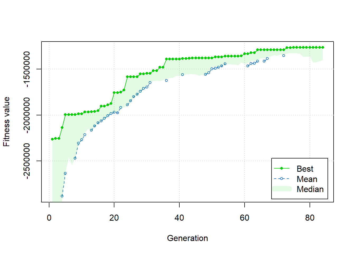
# Load necessary librarylibrary(GA)demand<-c(distribution_centers$Demand)# Define the objective functionobjective_function <-function(quantities) { quantities_matrix <-matrix(quantities, nrow =5, ncol =3, byrow =TRUE)# Calculate total loading costs loading_costs <-rowSums(quantities_matrix) * loading_costs_per_dc # Total loading costs for each DC# Calculate total transportation costs transportation_costs <-sum(quantities_matrix * transportation_costs)# Combine both costs total_cost <-sum(loading_costs) + transportation_costs# Check if demands are metif (any(colSums(quantities_matrix) < demand)) {return(Inf) # Penalize if demands are not met }return(total_cost)}# Set up the Genetic Algorithmnum_vars <-5*3# 5 warehouses, 3 distribution centersga_result <-ga(type ="real-valued",fitness =function(x) -objective_function(x), # Negate for minimizationlower =rep(0, num_vars), # Minimum quantityupper =rep(100, num_vars), # Maximum quantity (adjust as needed)popSize =50,maxiter =100,run =10,monitor =TRUE)
Kết quả tối ưu sẽ được trình bày ở bảng này (hơi màu mè 1 tí!!!)
📦 Warehouse Shipment Summary
Cost Breakdown & Machine Availability
🏢 Warehouse
🏬 Distribution Center
📦 Total Weight (kg)
⚖️ Weight Category
💼 Loading Cost
🚚 Transport Cost
💰 Total Cost
🛠 Machine
WH 1
DC 1
3.36
2.5 to 5
$64,300.00
$3,802,097.23
$3,866,397.23
✅
WH 2
DC 1
1.88
1.5 to 2.5
$40,680.00
$5,037,171.35
$5,077,851.35
❌
WH 3
DC 1
1.03
< 1.5
$144,640.00
$7,297,102.21
$7,441,742.21
❌
WH 4
DC 1
1.04
< 1.5
$25,130.00
$5,952,559.68
$5,977,689.68
✅
WH 5
DC 1
1.92
1.5 to 2.5
$18,750.00
$3,086,494.54
$3,105,244.54
❌
WH 1
DC 2
1.17
< 1.5
$11,610.00
$8,264,855.30
$8,276,465.30
❌
WH 2
DC 2
1.65
1.5 to 2.5
$105,460.00
$4,021,256.86
$4,126,716.86
✅
WH 3
DC 2
5.09
5 to 10
$51,140.00
$889,559.41
$940,699.41
✅
WH 4
DC 2
3.80
2.5 to 5
$120,840.00
$2,449,208.30
$2,570,048.30
✅
WH 5
DC 2
1.21
< 1.5
$70,030.00
$7,188,382.30
$7,258,412.30
❌
WH 1
DC 3
1.61
1.5 to 2.5
$70,730.00
$5,831,987.58
$5,902,717.58
✅
WH 2
DC 3
1.92
1.5 to 2.5
$83,890.00
$974,375.33
$1,058,265.33
❌
WH 3
DC 3
3.99
2.5 to 5
$64,990.00
$4,273,915.59
$4,338,905.59
❌
WH 4
DC 3
6.26
5 to 10
$134,780.00
$1,047,828.18
$1,182,608.18
❌
WH 5
DC 3
2.18
1.5 to 2.5
$96,240.00
$4,905,804.62
$5,002,044.62
❌
3 Báo cáo:
Và cuối cùng, sau khi có kết quả, mình sẽ dùng các thư viện gồm: Leaflet, gt, và biểu đồ Sankey phục vụ những mục đích khác nhau cho trực quan hóa dữ liệu.
Leaflet: Đây là một thư viện mạnh mẽ để tạo bản đồ tương tác. Nó cho phép người dùng dễ dàng thêm các lớp, điểm đánh dấu và pop-up, rất lý tưởng để trực quan hóa dữ liệu địa lý. Leaflet đặc biệt hữu ích để hiển thị các dữ liệu như vị trí, lộ trình, hoặc phân bố không gian.
gt: Gói gt được thiết kế để tạo ra các bảng chất lượng cao trong R. Nó cho phép người dùng định dạng và tạo kiểu cho bảng một cách dễ dàng, giúp chúng trở nên hấp dẫn và dễ đọc. gt hỗ trợ các tính năng như định dạng tùy chỉnh, dòng tóm tắt, và thậm chí thêm chú thích, nâng cao cách trình bày dữ liệu trong báo cáo.
Biểu đồ Sankey: Những biểu đồ này được sử dụng để trực quan hóa luồng và mối quan hệ giữa các danh mục khác nhau. Trong R, gói networkD3 hoặc ggalluvial có thể tạo ra biểu đồ Sankey, giúp hiểu cách các giá trị di chuyển giữa các nút, chẳng hạn như theo dõi hành trình người dùng hoặc hiển thị phân bổ tài nguyên.
Để kết nối các biểu đồ lại với nhau, ta thường nghĩ đến Shiny trong R nhưng vì chúng ta đang tạo website bằng Quarto nên output cuối cùng sẽ là một trang web tĩnh - static website. Do đó, nó sẽ không phản hồi với thông tin đầu vào của người dùng hoặc chạy bất kỳ mã R nào. Bạn có thể hình dung giống như bạn đang muốn xem biểu đồ về doanh thu trong tháng tiếp theo trên 1 biểu đồ trong Word - không thể làm được vì nó thuộc dạng văn bản, bạn chỉ đọc hoặc nhìn chứ không tương tác được.
Tuy vậy, sau một thời gian tìm hiểu, mình cũng tìm được cách để nhúng Shiny vào R để hiển thị trên Quarto. Nguồn tài liệu bạn có thể kham khảo ở trang này r-shinylive-demo.
Note
Shinylive là 1 extension của Quarto và được kích hoạt bằng:
filter:- quarto-ext/shinylive
các extension trong filter sẽ ảnh hưởng đến kết quả sau khi Quarto render xong. App Shiny chỉ xuất hiện sau đó, nên bạn cần đợi thêm tùy theo độ nặng của app.
#| '!! shinylive warning !!': |
#|   shinylive does not work in self-contained HTML documents.
#|   Please set `embed-resources: false` in your metadata.
#| viewerHeight: 1000
#| standalone: true
#| fig-cap: "Biểu đồ 3: Dashboard về lịch trình vận chuyển hàng dự tính"
pacman::p_load(
  leaflet,
  dplyr,
  networkD3,
  shiny,
  bslib,
  DT,
  htmltools
)

# Add value:
# Convert GA solution to a matrix
# Optimal quantities matrix
optimal_quantities <- matrix(c(
  43.306058, 10.87137, 13.26283,
  15.524054, 30.42748, 48.86716,
  7.599769, 44.93531, 27.46289,
  18.556927, 17.60396, 41.85203,
  16.305016, 13.15498, 21.79634
), nrow = 5, ncol = 3, byrow = TRUE)

# Warehouse data:
warehouses <- data.frame(
  ID = 1:5,
  Latitude = c(21.0285, 16.0545, 10.7769, 14.0583, 19.8060),
  Longitude = c(105.8040, 108.2022, 106.6957, 108.2772, 105.7460),
  District = c("Đống Đa", "Hải Châu", "Quận 1", "Mang Yang", "Đông Sơn"),
  Province = c("Hà Nội", "Đà Nẵng", "Hồ Chí Minh", "Gia Lai", "Thanh Hóa"),
  Address = c(
    "2RH3+9HX Đống Đa, Hà Nội, Việt Nam",
    "3632+RV4 Hải Châu, Đà Nẵng, Việt Nam",
    "QMGW+Q74 Quận 1, Hồ Chí Minh, Việt Nam",
    "375G+8VG Mang Yang, Gia Lai, Việt Nam",
    "RP4W+99X Đông Sơn, Thanh Hóa, Việt Nam"
  )
)

# Distribution center data:
distribution_centers <- data.frame(
  ID = 1:3,
  Latitude = c(17.97486, 11.77690, 15.12233),
  Longitude = c(102.6309, 106.6957, 108.7994),
  District = c("Viêng Chăn", "Lộc Ninh", "Quảng Ngãi"),
  Province = c("Lào", "Bình Phước", "Quảng Ngãi"),
  Address = c(
    "XJFJ+W8X Viêng Chăn, Lào",
    "QMGW+Q74 Lộc Ninh, Bình Phước, Việt Nam",
    "4QCX+WPQ Quảng Ngãi, Việt Nam"
  )
)

# Create a data frame with the warehouse data
result <- data.frame(
  Warehouse = c("WH 1", "WH 2", "WH 3", "WH 4", "WH 5",
                "WH 1", "WH 2", "WH 3", "WH 4", "WH 5",
                "WH 1", "WH 2", "WH 3", "WH 4", "WH 5"),
  DC = c("DC 1", "DC 1", "DC 1", "DC 1", "DC 1",
         "DC 2", "DC 2", "DC 2", "DC 2", "DC 2",
         "DC 3", "DC 3", "DC 3", "DC 3", "DC 3"),
  Has_Machine = c("Yes", "No", "No", "No", "No",
                  "No", "No", "No", "No", "No",
                  "No", "No", "No", "No", "No"),
  Total_Weight = c(4.3306058, 1.5524054, 0.7599769, 1.8556927, 1.6305016,
                   1.0871366, 3.0427479, 4.4935308, 1.7603961, 1.3154977,
                   1.3262832, 4.8867159, 2.7462887, 4.1852028, 2.1796338),
  Weight_Category = c("2.5 to 5", "1.5 to 2.5", "< 1.5", "1.5 to 2.5", "1.5 to 2.5",
                      "< 1.5", "2.5 to 5", "2.5 to 5", "1.5 to 2.5", "< 1.5",
                      "< 1.5", "2.5 to 5", "2.5 to 5", "2.5 to 5", "1.5 to 2.5"),
  Loading_Cost = c(64300, 40680, 144640, 38790, 18750,
                   11610, 97870, 36380, 69120, 70030,
                   143740, 91150, 64990, 114230, 96240),
  Transport_cost = c(3802097.2, 5037171.3, 7297102.2, 5952559.7, 3086494.5,
                     8264855.3, 4021256.9, 889559.4, 2449208.3, 7188382.3,
                     5831987.6, 974375.3, 4273915.6, 1047828.2, 4905804.6)
)

# Custom icon:
warehouse_icon <- makeIcon(
  iconUrl = "https://raw.githubusercontent.com/Loccx78vn/genetic-algorithm-method/refs/heads/main/img/warehouse_icon.png",
  iconWidth = 30,
  iconHeight = 30
)

dc_icon <- makeIcon(
  iconUrl = "https://raw.githubusercontent.com/Loccx78vn/genetic-algorithm-method/refs/heads/main/img/distribution_center.png",
  iconWidth = 30,
  iconHeight = 30
)
# Define a custom theme
my_theme <- bs_theme(
  version = 5,
  bootswatch = "litera",
  primary = "#3b5998",
  secondary = "#5cb85c",
  success = "#5cb85c",
  info = "#5bc0de",
  warning = "#f0ad4e",
  danger = "#d9534f"
)

# Define UI
ui <- page_fluid(
  theme = my_theme,

  # Custom CSS for better visualization
  tags$head(
    tags$style(HTML("
      .card-header {
        background-color: #3b5998;
        color: white;
        font-weight: bold;
      }
      .nav-tabs .nav-link.active {
        font-weight: bold;
        color: #3b5998;
        border-bottom: 2px solid #3b5998;
      }
      .nav-tabs .nav-link {
        color: #6c757d;
      }
      .checkbox span {
        font-weight: normal;
      }
      .checkbox input:checked + span {
        font-weight: bold;
        color: #3b5998;
      }
      .warehouse-selection {
        border-left: 4px solid #3b5998;
        padding-left: 10px;
      }
      .dataTables_wrapper {
        padding: 10px;
        border-radius: 5px;
      }
      .table thead th {
        background-color: #e9ecef;
      }
      .leaflet-container {
        border-radius: 8px;
        box-shadow: 0 2px 4px rgba(0,0,0,0.1);
      }
      .sankey-container {
        border: 1px solid #dee2e6;
        border-radius: 8px;
        padding: 10px;
        background-color: #f8f9fa;
      }
      .summary-stats {
        background-color: #f8f9fa;
        border-radius: 5px;
        padding: 10px;
        margin-bottom: 15px;
        border-left: 4px solid #3b5998;
      }
    "))
  ),

  # Page header - simplified
  card(
    card_header(
      tags$div(
        class = "d-flex align-items-center",
        tags$img(
          src = "https://raw.githubusercontent.com/Loccx78vn/genetic-algorithm-method/refs/heads/main/img/supply-chain-management.png",
          height = "30px",
          style = "margin-right: 10px;"
        ),
        h3("Warehouse Distribution Dashboard", class = "m-0")
      )
    ),
    card_body(
      "This dashboard shows the optimal distribution of goods from warehouses to distribution centers."
    )
  ),

  layout_sidebar(
    sidebar = sidebar(
      title = "Controls",
      width = 300,
      bg = "#f8f9fa",
      class = "warehouse-selection",

      h4("Warehouse Selection", class = "mb-3 text-primary"),

      p("Select one or more warehouses to view their distribution data on the map and in the charts."),

      checkboxGroupInput(
        inputId = "warehouse",
        label = NULL,
        choices = setNames(
          paste("Warehouse", 1:5),
          paste("Warehouse", 1:5, "-", warehouses$District, ",", warehouses$Province)
        ),
        selected = paste("Warehouse", 1)
      ),

      hr(),

      tags$div(
        class = "alert alert-info",
        icon("info-circle"),
        "Click on the map markers for detailed location information."
      )
    ),

    # Main content - restructured to put summary above map
    tabsetPanel(
      tabPanel(
        title = "Interactive Map",
        icon = icon("map"),
        card(
          full_screen = TRUE,
          height = "650px", # Increased height
          card_body(
            # Summary stats placed above the map
            tags$div(
              class = "summary-stats",
              uiOutput("summary_stats")
            ),
            # Map with increased height
            leafletOutput("map", height = "550px") # Increased map height
          )
        )
      ),

      tabPanel(
        title = "Cost Analysis",
        icon = icon("table"),
        card(
          full_screen = TRUE,
          height = "650px", # Increased to match
          card_header("Cost Table"),
          DTOutput("cost_table")
        )
      ),

      tabPanel(
        title = "Flow Diagram",
        icon = icon("diagram-project"),
        card(
          full_screen = TRUE,
          height = "650px", # Increased to match
          card_header("Distribution Flow Diagram"),
          tags$div(
            class = "sankey-container",
            uiOutput("sankey_diagram")
          )
        )
      )
    )
  )
)

# Define server logic
server <- function(input, output, session) {

  location <- reactive({
    req(input$warehouse)
    as.numeric(sub("Warehouse ", "", input$warehouse))
  })

  # Create the leaflet map
  output$map <- renderLeaflet({
    req(location())

    # Color palette for routes
    route_colors <- c("#FF5733", "#33A8FF", "#33FF57", "#D433FF", "#FFD133")

    # Initialize the map
    map <- leaflet() |>
      addTiles() |>
      addProviderTiles(providers$CartoDB.Positron) |>
      addMarkers(data = warehouses |> filter(ID %in% location()),
                 lat = ~Latitude,
                 lng = ~Longitude,
                 label = ~paste0("<strong> ID Warehouse: </strong> ", ID, "<br/> ",
                                 "<strong> Province: </strong> ", Province, "<br/> ",
                                 "<strong> District: </strong> ", District, "<br/> ",
                                 "<strong> Address: </strong> ", Address, "<br/> ") |>
                   lapply(htmltools::HTML),
                 icon = warehouse_icon) |>
      addMarkers(data = distribution_centers,
                 lat = ~Latitude,
                 lng = ~Longitude,
                 label = ~paste0("<strong> ID Distribution Center: </strong> ", ID, "<br/> ",
                                 "<strong> Province: </strong> ", Province, "<br/> ",
                                 "<strong> District: </strong> ", District, "<br/> ",
                                 "<strong> Address: </strong> ", Address, "<br/> ") |>
                   lapply(htmltools::HTML),
                 icon = dc_icon)

    qty_data <- optimal_quantities[location(), , drop = FALSE]

    # Add routes based on the optimal quantities with different colors
    route_colors <- c("#FF5733", "#33A8FF", "#33FF57", "#D433FF", "#FFD133")
    line_weights <- c(2, 3, 4, 5, 6)  # Variable line weights based on quantity

    # Add routes based on the optimal quantities
    for (i in seq_along(location())) {
      wh_id <- location()[i]
      wh_idx <- which(warehouses$ID == wh_id)
      color_idx <- (wh_id - 1) %% length(route_colors) + 1

      for (j in 1:ncol(qty_data)) {
        if (qty_data[i, j] > 0) {
          route_start <- warehouses[warehouses$ID == wh_id, c("Longitude", "Latitude")]
          route_end <- distribution_centers[distribution_centers$ID == j, c("Longitude", "Latitude")]

          # Calculate line weight based on quantity (normalized)
          weight_multiplier <- qty_data[i, j] / max(optimal_quantities) * 5
          weight <- max(2, min(6, weight_multiplier + 2))  # Scale between 2-6

          map <- map |>
            addPolylines(
              lat = c(route_start$Latitude, route_end$Latitude),
              lng = c(route_start$Longitude, route_end$Longitude),
              color = route_colors[color_idx],
              weight = weight,
              opacity = 0.7,
              label = paste0("Quantity: ", round(qty_data[i, j], 2)),
              dashArray = "5, 5",
              popup = paste0(
                "<strong>From:</strong> Warehouse ", wh_id,
                "<br><strong>To:</strong> Distribution Center ", j,
                "<br><strong>Quantity:</strong> ", round(qty_data[i, j], 2)
              )
            )
        }
      }
    }

    map  # Return the modified map
  })

  # Render the cost table
  output$cost_table <- renderDT({
    req(location())

    cost_data <- result |>
      filter(Warehouse %in% paste("WH", location())) |>
      select(c(Warehouse, DC, Loading_Cost, Transport_cost))

    # Add a Total Cost column
    cost_data$Total_Cost <- cost_data$Loading_Cost + cost_data$Transport_cost

    # Format currency values
    cost_data$Loading_Cost <- formatC(cost_data$Loading_Cost, format="f", digits=0, big.mark=",")
    cost_data$Transport_cost <- formatC(cost_data$Transport_cost, format="f", digits=0, big.mark=",")
    cost_data$Total_Cost <- formatC(cost_data$Total_Cost, format="f", digits=0, big.mark=",")

    datatable(cost_data,
              options = list(
                pageLength = 10,
                dom = 'Bfrtip',
                buttons = c('copy', 'csv', 'excel'),
                initComplete = JS(
                  "function(settings, json) {",
                  "$(this.api().table().header()).css({'background-color': '#3b5998', 'color': 'white'});",
                  "}"
                ),
                columnDefs = list(
                  list(className = 'dt-center', targets = "_all")
                )
              ),
              rownames = FALSE,
              class = 'compact stripe hover') |>
      formatStyle(
        'Warehouse',
        backgroundColor = styleEqual(
          paste("WH", 1:5),
          c('#FFC3A0', '#A0D2FF', '#C8FFB0', '#D5A0FF', '#FFF0A0')
        )
      ) |>
      formatStyle(
        'DC',
        backgroundColor = styleEqual(
          c("DC 1", "DC 2", "DC 3"),
          c('#FFDDC3', '#C3E5FF', '#DDFFC3')
        )
      )
  })


  # Create and render the Sankey diagram
  selected_indices <- reactive({
    as.numeric(sub("Warehouse ", "", input$warehouse))
  })

  # Filter data based on selected warehouses
  filtered_data <- reactive({
    result |>
      filter(Warehouse %in% paste("WH",input$warehouse))
  })

  # Create and render the Sankey diagram
  output$sankey_diagram <- renderUI({
    req(length(selected_indices()) > 0)

    # Create links data frame
    links <- data.frame()

    # Add links for each selected warehouse
    for (i in 1:length(selected_indices())) {
      wh_idx <- selected_indices()[i]
      wh_data <- optimal_quantities[wh_idx, , drop = FALSE]

      # Add links for each DC
      for (j in 1:ncol(wh_data)) {
        if (wh_data[1, j] > 0) {
          links <- rbind(links, data.frame(
            source = i - 1,  # Use index in selected warehouses (0-based)
            target = length(selected_indices()) + j - 1,  # DCs come after warehouses
            value = wh_data[1, j]
          ))
        }
      }
    }

    # Only proceed if we have links
    req(nrow(links) > 0)

    # Create nodes data frame
    nodes <- data.frame(
      name = c(paste("Warehouse", selected_indices()), paste("DC", 1:3))
    )

    # Create the Sankey network
    sankey <- sankeyNetwork(
      Links = links,
      Nodes = nodes,
      Source = "source",
      Target = "target",
      Value = "value",
      NodeID = "name",
      height = 500,
      width = 800,
      fontSize = 12,
      nodeWidth = 20,
      sinksRight = TRUE
    )

    # Customize tooltips and add click functionality to show a value panel
    sankey <- htmlwidgets::onRender(sankey, "
    function(el, x) {
      // Create a div for the value panel
      var valuePanel = d3.select('body').append('div')
        .attr('class', 'value-panel')
        .style('position', 'absolute')
        .style('padding', '8px')
        .style('background', 'lightgray')
        .style('border', '1px solid gray')
        .style('border-radius', '4px')
        .style('opacity', 0);  // Start hidden

      // Append title for tooltips on hover
      d3.selectAll('.link')
        .append('title')
        .text(function(d) { return 'Quantity: ' + d.value.toFixed(2); });  // Show value on hover

      // Add click event to show the value panel
      d3.selectAll('.link')
        .on('click', function(event, d) {
          // Ensure we get the correct value
          var value = d3.select(this).datum().value;
          var source = nodes.name[d.source.index];
          var target = nodes.name[d.target.index];

          // Position the value panel near the mouse cursor
          valuePanel
            .style('left', (event.pageX + 5) + 'px')
            .style('top', (event.pageY + 5) + 'px')
            .style('opacity', 1)  // Make it visible
            .html('From: ' + source + '<br>To: ' + target + '<br>Quantity: ' + value.toFixed(2));  // Set the text with details

          // Hide the panel after a delay
          setTimeout(function() {
            valuePanel.style('opacity', 0);
          }, 3000);  // Change the delay as needed
        });
    }
    ")

    # Add title and caption
    tagList(
      sankey,
      tags$p(style = "font-size: 12px; text-align: right;",
             "A wider arrow indicates that a larger quantity is being sent from that warehouse to a distribution center.")
    )
  })

  # Add a summary statistics output at the bottom of the map tab
  output$summary_stats <- renderUI({
    req(location())

    selected_data <- result |>
      filter(Warehouse %in% paste("WH", location()))

    total_loading <- sum(selected_data$Loading_Cost)
    total_transport <- sum(selected_data$Transport_cost)
    total_weight <- sum(selected_data$Total_Weight)

    div(
      class = "mt-3 p-3 bg-light rounded",
      h4("Summary Statistics", class = "text-primary mb-3"),
      div(class = "row",
          div(class = "col-md-4",
              div(class = "card text-white bg-primary mb-3",
                  div(class = "card-body",
                      h5(class = "card-title", "Total Weight"),
                      h3(class = "card-text", paste0(round(total_weight, 2), " tons"))
                  )
              )
          ),
          div(class = "col-md-4",
              div(class = "card text-white bg-success mb-3",
                  div(class = "card-body",
                      h5(class = "card-title", "Total Loading Cost"),
                      h3(class = "card-text", paste0("₫", formatC(total_loading, format="f", digits=0, big.mark=",")))
                  )
              )
          ),
          div(class = "col-md-4",
              div(class = "card text-white bg-info mb-3",
                  div(class = "card-body",
                      h5(class = "card-title", "Total Transport Cost"),
                      h3(class = "card-text", paste0("₫", formatC(total_transport, format="f", digits=0, big.mark=",")))
                  )
              )
          )
      )
    )
  })
}

# Run the application
shinyApp(ui = ui, server = server)
Bạn có thể thấy với dashboard như vậy, ta có thể xem được nhiều thông tin hơn như:
Vị trí cụ thể của từng WH và DC cũng như là các tuyến đường dự kiến bằng các đường thẳng minh họa. (Xem Map tab)
Thông tin về chi phí Loading cost và Transporation cost cũng như lượng hàng cần vận chuyển cho từng nhà kho. (Xem Table and Sankey tab)
Bạn có thể xem cho 1 hoặc nhiều nhà kho bằng cách click trên thanh Filter. Ngoài ra, đặc biệt với Sankey chart, bạn cần giữ hoặc click chuột vào tuyến để xem được số lượng hàng.
Tuy rất thích R nhưng mình vẫn không thích xây dựng dashboard bằng R lắm vì quá nặng về code và không hiệu quả về thời gian, nguồn lực. Các tools khác mình ưu tiên hơn như Power BI, Tableau hoặc các BIs mà công ty bạn sử dụng trong công việc hằng ngày.
---title: "Genetic Algorithms in R"subtitle: "Việt Nam, 2024"categories: ["SupplyChainManagement", "Logistics","Genetic Algorithm"]description: "Đây là bài viết của tôi về cách sử dụng R trong ứng dụng Genetic Algorithm trong Supply Chain"number-sections: trueformat: html: code-fold: true code-tools: truecrossref: labels: alpha a subref-labels: romanfilters: - quarto-ext/shinylivebibliography: references.bib---# Giới thiệu:```{r}#| warning: false#| message: false#| echo: false#Call packagespacman::p_load(rio, here, janitor, tidyverse, dplyr, magrittr, ggplot2, purrr, lubridate, mice, plotly, DiagrammeR, shinylive)```## Vài điểm về thuật toán Genetic:**GA** hay **Genetic Algorithm** là 1 thuật toán tối ưu hóa ngẫu nhiên (**stochastic search algorithms**), được phát triển dựa trên lý thuyết tiến hóa và sự chọn lọc tự nhiên của sinh học [@lucascrucca2013].Ở thời cấp 3, bạn đã từng học về lý thuyết tiến hóa và chọn lọc tự nhiên của [Charles Darwin](https://vi.wikipedia.org/wiki/Charles_Darwin) và [Alfred Russel](https://vi.wikipedia.org/wiki/Alfred_Russel_Wallace) ở môn Sinh học. Nếu bạn cũng từng liệt Sinh như tôi thì bạn quên cũng không sao 😅😅. Vậy thì để tôi giải thích lại như sau:Sự tiến hóa là sự thay đổi đặc điểm di truyền của 1 quần thể sinh vật, ví dụ điển hình chính là từ loại vượn đã tiến hóa thành hình dạng con người văn minh như các bạn bây giờ. Vậy quá trình tiến hóa đó diễn ra khi có sự chọn lọc tự nhiên tạo ra các biến dị di truyền (Ví dụ: đột biến,...) và kết quả là các cá thể đột biến trở nên phổ biến hơn hoặc hiếm gặp hơn trong quần thể. Vậy điều kiện để xảy ra sự chọn lọc tự nhiên có thể là sự thay đổi về môi trường sống, địa lý,... dẫn tới sự khác nhau về khả năng sống sót và sinh sản.Kết cục là xuất hiện các cá thể đột biến "mạnh mẽ hơn" hoặc đúng là "đặc biệt hơn" có khả năng tồn tại khi xuất hiện sự thay đổi lớn, ví dụ như dưới đây, do sự thay đổi về địa điểm sống, từ một loại chim sẻ đã phát triển thành 3 phân họ khác nhau.```{=html}<div style="text-align: center; margin-bottom: 20px;"> <img src="img/Natural_selection.jpg" style="max-width: 80%; height: auto; display: block; margin: 0 auto;"> <!-- Picture Name --> <div style="text-align: left; margin-top: 10px;"> Hình 1: Ví dụ về chọn lọc tự nhiên </div> <!-- Source Link --> <div style="text-align: right; font-style: italic; margin-top: 5px;"> Source: <a href="https://www.biologyonline.com/dictionary/natural-selection">Link to Image</a> </div></div>```Vậy lí thuyết này liên quan gì tới vấn đề tối ưu hóa. Thông thường khi bạn muốn tối ưu hóa một vấn đề gì đó, bạn cần xây dựng mô hình định lượng nó, ví dụ như dưới ảnh này ta đang có mô hình [MILP](https://www.mathworks.com/help/optim/ug/mixed-integer-linear-programming-algorithms.html) nhằm hoạch định tuyến đường và tối ưu hóa quãng đường di chuyển.```{=html}<div style="text-align: center; margin-bottom: 20px;"> <img src="img/MILP.png" style="max-width: 100%; height: auto; display: block; margin: 0 auto;"> <!-- Picture Name --> <div style="text-align: left; margin-top: 10px;"> Hình 2: Mô hình VRP </div> <!-- Source Link --> <div style="text-align: right; font-style: italic; margin-top: 5px;"> Source: <a href="https://medium.com/@rihot_gusron/capacitated-vehicle-routing-problem-with-lingo-427c2d3bf724">Link to Image</a> </div></div>```Mục tiêu của hàm chính là tìm ra giá trị nhỏ nhất nghĩa là chi phí cho việc di chuyển của xe là nhỏ nhất. Do đó, bạn có thể hình dung rằng **giá trị nhỏ nhất** đó như là các **cá thể đột biến** có khả năng sống sót cao nhất trong quẩn thể.Vì vậy thuật toán **Genetic** (GA) chính là lặp đi lặp lại sự chọn lọc tự nhiên trong một quần thể hoặc một mẫu để đến cuối cùng tìm ra cá thể vượt trội nhất.## Cách hoạt động GA trong ML:Trong Machine Learning, GA nhằm tìm ra đúng các biến cần thiết để xây dựng mô hình tốt nhất. Gỉa sử chúng ta có 2 mô hình là:- Mô hình 1: gồm các biến A,C,D.- Mô hình 2: gồm biến A,B,E.Vậy mô hình nào mới là tốt nhất cho mô hình dự đoán ? Chúng ta chưa biết được và chỉ có thể so sánh nó thông qua thuật toán Genetic.Về quy trình, thuật toán Genetic sẽ có cách hoạt động như dưới đây. Quy trình này mình tham khảo của [@rohithgandhi2018].```{=html}<div style="text-align: center; margin-bottom: 20px;"> <img src="img/Genetic_Algorithm.png" style="max-width: 100%; height: auto; display: block; margin: 0 auto;"> <!-- Picture Name --> <div style="text-align: left; margin-top: 10px;"> Hình 3: Thuật toán Genetic </div> <!-- Source Link --> <div style="text-align: right; font-style: italic; margin-top: 5px;"> Source: <a href="https://medium.datadriveninvestor.com/genetic-algorithms-9f920939f7cc">Link to Image</a> </div></div>```Diễn giải cách hoạt động:- Bước 1 (**Initialisation**): mỗi biến được xem là *Gene* và nhiều *Gene* gộp lại thành một mô hình hay gọi là *Chromosome* và nhiều *Chromosome* sẽ tạo thành một quần thể (*Population*). Việc này giống như là bạn đang trình bày hết các phương án có thể sử dụng.```{=html}<div style="text-align: center; margin-bottom: 20px;"> <img src="img/Term.png" style="max-width: 100%; height: auto; display: block; margin: 0 auto;"> <!-- Picture Name --> <div style="text-align: left; margin-top: 10px;"> Hình 4: Các thuật ngữ trong GA </div> <!-- Source Link --> <div style="text-align: right; font-style: italic; margin-top: 5px;"> Source: <a href="https://www.doc.ic.ac.uk/research/technicalreports/2003/DTR03-4.pdf">Link to Image</a> </div></div>```- Bước 2 (**Fitness Function**): Bạn cần xây dựng một hàm mục tiêu để tính toán giá trị cho các mô hình ở bước 1.- Bước 3 (**Selection**): Biến nào có giá trị yếu kém sẽ bị loại và quá trình tính toán sẽ tiếp tục ở thế hệ của nó tiếp theo. Diễn giải đơn giản hơn là chúng ta thử một cách khác và cố gắng cải thiện kết quả.- Bước 4 (**Crossover**): Tạo ra mô hình gồm các biến tốt đã lựa chọn ở bước 3. Ví dụ như biến A, B là tốt cho mô hình.- Bước 5 (**Mutation**): Thay đổi mô hình đầu vào đã bao gồm các biến ở bước 4 và bắt đầu lại từ bước 1. Ví dụ mô hình cần chọn gồm 5 biến và ta đã chọn được biến A,B là tốt. Do đó, khi quay lại bước 1, ta chỉ cần chọn thêm 3 biến thay vì 5 biến như thông thường.# Thực hành trong R:Sau khi đã sơ lược về thuật toán, bây giờ ta sẽ vào phần thực hành trong R. Vậy làm sao để ứng dụng thuật toán Genetic trong R, mình đã kham khảo qua nhiều nguồn tài liệu và tổng hợp dưới đây:**Xây dựng hàm mục tiêu**: hàm mục tiêu là bước quan trọng nhất trong thuật toán Genetic vì nó là cơ sở để đánh giá và lựa chọn cá thể vượt trội nhất. Và hàm mục tiêu sẽ luôn khác nhau tùy vào vấn đề mà ta đặt ra. Giả sử chúng ta muốn tối ưu chi phí thì nó là hàm Min, còn ta muốn tối đa lợi nhuận thì nó sẽ là hàm Max.Vậy hàm mục tiêu của bài toán trên trong R, bạn có thể tham khảo phần code bên dưới mình:::: callout-important### Type of fitness functionĐối số `type` trong hàm có 3 giá trị:- `"binary"`: đại diện cho biến quyết định dạng phân loại, ví dụ: có/không- `"real-valued"`: dùng dể tối ưu cho các biến quyết định là dạng số thực, số tự nhiên.- `"permutation"`: cho các vấn đề liên quan đến việc sắp xếp lại các biến thành danh sách, ví dụ: thang đo Likert.:::Chi tiết về hàm `ga()`, bạn có thể tham khảo tài liệu của [@lucascrucca2013].## Thuật toán Genetic:Vậy bây giờ chúng ta sẽ xử lí bài toán trên theo thuật toán **Genetic**Gỉa sử chúng ta có bài toán về vận chuyển hàng từ nhà kho để thỏa mãn nhu cầu ở các điểm **DC (Distribution center)**. Và công thức để tính toán được chi phí là:Hàm chi phí tổng thể được xác định như sau:$$TC = \sum_{i=1}^{m} \left( D_{ij} \times \frac{P}{F} \times 0.4 + LC_i \right) \times Q_j$$Trong bài toán này, bạn sẽ cần dữ liệu để tính toán 2 thông số là: **Phí bốc xếp (Loading cost)** và **Chi phí vận chuyển (Transportation cost)**.Nếu trong công việc thường ngày ở công ty, chúng ta sẽ cần lấy dữ liệu từ **Data warehouse** bằng SQL hoặc các phần mềm **Business Intelligence** khác. Ở đây, nhằm mục đích học tập, mình đã tạo ra code ở phía dưới để xây dựng dữ liệu cho các bạn luyện tập.```{r}# Create a data frame for loading costsloading_costs <-data.frame(Warehouse =rep(paste("WH", 1:5), each =4),ID =rep(1:5, times =4),Weight_Category =rep(c("< 2 tons", "2 to 5 tons", "5 to 10 tons", "> 10 tons"), times =5),Has_Machine =rep(c("Yes", "No", "Yes", "No", "No"), each =4),Loading_Cost =c(80, 100, 120, 160, # Warehouse 1 (with machine)110, 150, 180, 210, # Warehouse 2 (without machine)85, 105, 125, 140, # Warehouse 3 (with machine)150, 170, 190, 210, # Warehouse 4 (without machine)140, 165, 185, 215) # Warehouse 5 (without machine))# Set seed for reproducibilityset.seed(123)# Define parametersweight_categories <-c("< 1.5", "1.5 to 2.5", "2.5 to 5", "5 to 10", "> 10")# Create the data frameloading_costs <-data.frame(Warehouse =rep(1:5, each =15), # 5 warehouses, 15 rows eachDC =rep(rep(1:3, each =5), times =5), # Repeat 1, 2, 3 for each warehouseWeight_Category =rep(weight_categories, times =15), # Repeat categories for 15 rowsLoading_Cost =round(runif(75, 5, 150), 2),Has_Machine =sample(c("Yes", "No"), 75, replace =TRUE))# Define warehouses with coordinates (latitude, longitude)warehouses <-data.frame(ID =1:5,Latitude =c(21.0285, 16.0545, 10.7769, 14.0583, 19.8060), # Example latitudes (Hanoi, HCMC, Da Nang, etc.)Longitude =c(105.804, 108.2022, 106.6957, 108.2772, 105.7460) # Example longitudes)# Define distribution centers data in Vietnam (example coordinates)distribution_centers <-data.frame(ID =1:3,Demand =c(90, 30, 150),Latitude =c(17.974855, 11.7769, 15.122327), # Example latitudes (Hanoi, Da Nang, HCMC)Longitude =c(102.630867, 106.6957, 108.799357) # Example longitudes)```Nếu bạn từng gặp khó khăn trong việc phải đối mặt với cả đống dữ liệu từ hệ thống và chưa biết lấy dữ liệu nào để phân tích hoặc gộp bảng nào qua bảng nào thì lời khuyên của mình là hãy vẽ bảng **Entity relation diagram (ERD)**.**ERD** là một công cụ trực quan dùng để mô tả cấu trúc dữ liệu trong cơ sở dữ liệu. ERD thể hiện các thực thể (*entities*), thuộc tính (*attributes*), và các mối quan hệ (*relationships*) giữa chúng. Các thực thể thường được biểu diễn dưới dạng hình chữ nhật, thuộc tính dưới dạng hình ellips, và mối quan hệ bằng hình thoi hoặc đường nối. ERD giúp lập kế hoạch cho thiết kế cơ sở dữ liệu, đảm bảo rằng các yếu tố dữ liệu và quan hệ giữa chúng được xác định rõ ràng, tạo nền tảng cho việc phát triển và quản lý dữ liệu hiệu quả.Như biểu đồ dưới đây, mình đang có 3 bảng gồm:- Bảng thông tin chi tiết về DC.- Bảng thông tin chi tiết về WH.- Bảng giá về loading cost và transportation cost từ WH đến DC.Và các bạn có thể dễ dàng hình dung các mối quan hệ thông qua bảng **Entity relation diagram (ERD)** dưới đây:```{r}#| echo: false#| fig-subcap: "Biểu đồ 1: EDR model"library(datamodelr)# Create the data model from your data framesdm1 <-dm_from_data_frames(list(Warehouses = warehouses,Loading_Costs = loading_costs,Distribution_Centers = distribution_centers)) |>dm_set_key("Warehouses", "ID") |>dm_set_key("Loading_Costs", c("Warehouse", "DC")) |>dm_set_key("Distribution_Centers", "ID") |>dm_add_references( Loading_Costs$Warehouse == Warehouses$ID, # Correct reference Loading_Costs$DC == Distribution_Centers$ID # Assuming this is the correct reference )# Create and render the ERDdm_create_graph(dm1, rankdir ="LR", columnArrows =TRUE) |>dm_render_graph()```::: callout-tip### Tải package datamodelr:Mình tạo biểu đồ này bằng thư viện `datamodelr`. Bạn có thể tải bằng cú pháp: `devtools::install_github("bergant/datamodelr")`:::### Dữ liệu đầu vào:Như vậy, dựa vào đó, ta sẽ tính toán được 2 *matrix* về chi phí:- Bảng giá loading ở các kho. (Hình bên trái)- Bảng chi phí vận chuyển từ từng WH đến các DCs. (Hình bên phải)```{r}#| warning: false#| message: false## Calculate the transportation cost:# Haversine distance functionhaversine <-function(lat1, lon1, lat2, lon2) { R <-6371# Radius of Earth in kilometers dlat <- (lat2 - lat1) * pi /180 dlon <- (lon2 - lon1) * pi /180 a <-sin(dlat /2) *sin(dlat /2) +cos(lat1 * pi /180) *cos(lat2 * pi /180) *sin(dlon /2) *sin(dlon /2) c <-2*atan2(sqrt(a), sqrt(1- a)) R * c # Distance in kilometers}# Calculate distance matrix based on coordinatesdistance_matrix <-matrix(0, nrow =nrow(warehouses), ncol =nrow(distribution_centers))for (i in1:nrow(warehouses)) {for (j in1:nrow(distribution_centers)) { distance_matrix[i, j] <-haversine( warehouses$Latitude[i], warehouses$Longitude[i], distribution_centers$Latitude[j], distribution_centers$Longitude[j] ) }}# Define the fuel price (example value)fuel_price <-20# Fuel price per kilometer# Calculate transportation coststransportation_costs <- distance_matrix * fuel_price *0.4## Calculate the loading cost:weights_per_good <-0.1mean_loading_cost<-loading_costs |>group_by(DC, Warehouse) |>summarise(mean =mean(Loading_Cost,na.rm =TRUE)/1000/weights_per_good) |># Assumes weighted of goods is 0.1kg ungroup()library(data.table)# Reshape the data frame to a wide formatmean_cost_matrix <- reshape2::dcast(mean_loading_cost, Warehouse ~ DC, value.var ="mean")# Convert the data frame to a matrix and remove the Warehouse columnloading_costs_per_dc <-as.matrix(mean_cost_matrix[,-1])# Set row names as the warehouse namesrownames(loading_costs_per_dc) <- mean_loading_cost$Warehouse[!duplicated(mean_loading_cost$Warehouse)]```::: {.panel-tabset}#### Bảng chi phí bốc xếp```{r}#| warning: false#| message: false#| echo: false#| fig-cap: ["Biểu đồ 2: Heatmap cho bảng chi phí bốc xếp"]# Code tạo hai biểu đồlibrary(ggplot2)# Convert the distance matrix to a data framedistance_df <- reshape2::melt(transportation_costs)colnames(distance_df) <-c("Warehouse", "Distribution_Center", "Transportation_Cost")# Plot the distance matrix with updated colorsggplot(distance_df, aes(x = Warehouse, y = Distribution_Center, fill = Transportation_Cost)) +geom_tile(color ="white", linewidth =0.5) +# Add borders to tilesgeom_text(aes(label = scales::comma(Transportation_Cost, accuracy =1)), color =ifelse(distance_df$Transportation_Cost >max(distance_df$Transportation_Cost)/2, "white", "black"),size =3.5) +# Adaptive text colorscale_fill_gradient2(low ="#f7fbff", mid ="#6baed6", high ="#08519c",midpoint =median(distance_df$Transportation_Cost),name ="Cost (VNĐ)",labels = scales::comma ) +theme_minimal() +labs(title ="Transportation Costs Between Facilities",subtitle ="Costs shown in Vietnamese Dong (VNĐ)",x ="Warehouse",y ="Distribution Center" ) +theme(axis.text.x =element_text(angle =45, hjust =1, face ="bold", size =12),axis.text.y =element_text(face ="bold", size =12),axis.title.x =element_text(size =14, face ="bold", margin =margin(t =15)),axis.title.y =element_text(size =14, face ="bold", margin =margin(r =15)),plot.title =element_text(face ="bold", size =16),plot.subtitle =element_text(size =12, color ="gray30"),panel.grid =element_blank(), # Remove grid lineslegend.position ="right" )```#### Bảng giá vận chuyển:```{r}#| warning: false#| message: false#| echo: false#| fig-cap: ["Biểu đồ 3: Bảng giá vận chuyển từ WH đến DC"]# Convert the transportation costs matrix to a data framelibrary(gt)library(gtExtras)# Create a gt tablem<-loading_costs |>mutate(Loading_Cost = Loading_Cost *1000,DC =paste("DC",DC),Warehouse =paste("WH",Warehouse)) # Convert to currencyhead(m[order(-m$Loading_Cost),]) |>gt() |>fmt_currency(columns = Loading_Cost,currency ="VND",decimals =0,use_seps =TRUE ) |>tab_header(title =md("**Loading Costs by weight category in each warehouses**"),subtitle =md("Table just contains **expected loading cost**") ) |>opt_align_table_header(align ="center") |>cols_label(Loading_Cost ="Loading Cost (VNĐ)",Weight_Category ="Weight Category",Has_Machine ="Has Machine",DC ="Distribution Center" ) |>data_color(method ="numeric",palette ="viridis",reverse =TRUE) |>gt_theme_pff() |>tab_style(style =list(cell_text(align ="center")),locations =cells_body(columns =everything())) |>tab_style(style =list(cell_text(align ="center") ),locations =list(cells_column_labels(everything()) ) ) |>tab_source_note(source =md("*Source: package gt in R*")) |>tab_style(style ="font-weight: bold",locations =cells_body(Weight_Category) )```:::### Xây dựng hàm mục tiêu:Sau khi đã có đủ dữ liệu, bạn sẽ bắt đầu viết hàm mục tiêu và dùng thuật toán GA để tìm ra giá trị tối ưu nhất.Trong hàm `ga` từ gói **GA** trong R, có một số đối số quan trọng cho phép bạn tùy chỉnh thuật toán di truyền. Dưới đây là một cái nhìn tổng quan về một số đối số quan trọng:- **type**: Chỉ định loại tối ưu hóa (ví dụ: `"real-valued"`, `"binary"` hoặc `"permutation"`).- **fitness**: Hàm đánh giá độ phù hợp; nó nên nhận một vector tham số làm đầu vào và trả về một giá trị số.- **lower** và **upper**: Định nghĩa giới hạn cho các biến nếu bạn đang tối ưu hóa trong không gian liên tục (dùng cho các loại giá trị thực).- **popSize**: Thiết lập kích thước quần thể cho mỗi thế hệ.- **maxiter**: Chỉ định số thế hệ tối đa để chạy thuật toán.- **run**: Chỉ định số thế hệ để chạy thuật toán mà không có sự cải thiện trước khi dừng lại.- **pmutation**: Xác suất xảy ra đột biến trong quần thể.- **elitism**: Xác định xem các cá thể tốt nhất có nên được giữ lại trong thế hệ tiếp theo hay không.Những đối số này giúp điều chỉnh thuật toán di truyền cho các nhu cầu tối ưu hóa cụ thể của bạn, cho phép hiệu suất tốt hơn và hội tụ về các giải pháp tối ưu.Ngoài ra, còn có các lưu ý cho bạn khi sử dụng R như sau:::: callout-caution##### Lưu ý khi dùng hàm ga():Hàm `ga()` phải có ít nhất 2 đối số là `type` và `fitness thì R mới chạy được.`- Riêng khi type = "binary" thì cần thêm đối số `nBits.`- Còn khi `type = "real-valued"/"permutation"` thì cần thêm đối số `min` và `max`.:::```{r}#| message: false#| warning: false#| output: false# Load necessary librarylibrary(GA)demand<-c(distribution_centers$Demand)# Define the objective functionobjective_function <-function(quantities) { quantities_matrix <-matrix(quantities, nrow =5, ncol =3, byrow =TRUE)# Calculate total loading costs loading_costs <-rowSums(quantities_matrix) * loading_costs_per_dc # Total loading costs for each DC# Calculate total transportation costs transportation_costs <-sum(quantities_matrix * transportation_costs)# Combine both costs total_cost <-sum(loading_costs) + transportation_costs# Check if demands are metif (any(colSums(quantities_matrix) < demand)) {return(Inf) # Penalize if demands are not met }return(total_cost)}# Set up the Genetic Algorithmnum_vars <-5*3# 5 warehouses, 3 distribution centersga_result <-ga(type ="real-valued",fitness =function(x) -objective_function(x), # Negate for minimizationlower =rep(0, num_vars), # Minimum quantityupper =rep(100, num_vars), # Maximum quantity (adjust as needed)popSize =50,maxiter =100,run =10,monitor =TRUE)``````{r}#| echo: false#| warning: false#| message: false# Print the summary of the GA resultplot(ga_result)# Assuming ga_result@solution contains optimal quantitiesga_result_solution <-c(ga_result@solution)# Reshape the solution into a matrix (5 warehouses x 3 DCs)optimal_quantities <-matrix(ga_result@solution,nrow =5, ncol =3, byrow =TRUE)# Convert the matrix to a data frameweights<-optimal_quantities* weights_per_goodrownames(weights) <-1:5colnames(weights) <-1:3library(reshape2)real_weighted <-melt(weights)# Rename the columnscolnames(real_weighted) <-c("Warehouse", "DC", "Total_Weight")# Perform left joinresult <- real_weighted |>left_join(loading_costs, by =c("Warehouse", "DC"))result <-result |>mutate(Price =case_when( Total_Weight <1.5~"< 1.5", Total_Weight <2.5~"1.5 to 2.5", Total_Weight <5~"2.5 to 5", Total_Weight <10~"5 to 10", Total_Weight >=10~"> 10",is.na(Total_Weight) ~NA_character_# Handle NA explicitly if needed ))result<-result |>filter(Weight_Category == Price) |>select(-Price)# Join with tranportation cost table:rownames(transportation_costs) <-1:5colnames(transportation_costs) <-1:3transport<-melt(transportation_costs)# Rename the columnscolnames(transport) <-c("Warehouse", "DC", "Transport_cost")result<-left_join(result, transport,by=c("Warehouse", "DC"))# Adjust:result<-result |>mutate(Loading_Cost = Loading_Cost*1000,Transport_cost = Transport_cost*1000,DC =paste("DC",DC),Warehouse =paste("WH",Warehouse)) # Reorder cols in table:result<-result[,c("Warehouse","DC","Has_Machine","Total_Weight","Weight_Category","Loading_Cost","Transport_cost")]```Kết quả tối ưu sẽ được trình bày ở bảng này (hơi màu mè 1 tí!!!)```{r}#| echo: false#| message: false#| warning: falselibrary(gt)library(dplyr)library(scales)# Add Total_Cost column and Has_Machine_Iconresult <- result |>mutate(Total_Cost = Loading_Cost + Transport_cost,Has_Machine_Icon =ifelse(Has_Machine =="Yes", "✅", "❌") ) |>select(-Has_Machine)# Find the row with highest total costmax_total_cost <-max(result$Total_Cost, na.rm =TRUE)# Build enhanced GT tableresult |>gt() |>tab_header(title =html("<b>📦 Warehouse Shipment Summary</b>"),subtitle =md("Cost Breakdown & Machine Availability") ) |>fmt_currency(columns =c(Loading_Cost, Transport_cost, Total_Cost),currency ="USD" ) |>fmt_number(columns = Total_Weight,decimals =2 ) |>data_color(columns = Total_Weight,colors =col_numeric(palette =c("lightblue", "blue"),domain =NULL ) ) |>data_color(columns = Loading_Cost,colors =col_numeric(palette =c("lightyellow", "orange"),domain =NULL ) ) |>data_color(columns = Transport_cost,colors =col_numeric(palette =c("lightpink", "deeppink"),domain =NULL ) ) |>data_color(columns = Total_Cost,colors =col_numeric(palette =c("lightgreen", "forestgreen"),domain =NULL ) ) |>tab_style(style =cell_text(weight ="bold"),locations =cells_body(columns =vars(Total_Cost),rows = Total_Cost == max_total_cost ) ) |>tab_style(style =cell_fill(color ="lightgray"),locations =cells_body(columns =vars(Has_Machine_Icon),rows = Has_Machine_Icon =="✅" ) ) |>tab_style(style =cell_fill(color ="#f5e1f7"),locations =cells_body(columns =vars(Has_Machine_Icon),rows = Has_Machine_Icon =="❌" ) ) |>tab_style(style =cell_fill(color ="#fdf5e6"),locations =cells_body(columns =vars(Weight_Category),rows = Weight_Category =="Light" ) ) |>tab_style(style =cell_fill(color ="#ffe4b5"),locations =cells_body(columns =vars(Weight_Category),rows = Weight_Category =="Medium" ) ) |>tab_style(style =cell_fill(color ="#ffcccb"),locations =cells_body(columns =vars(Weight_Category),rows = Weight_Category =="Heavy" ) ) |>cols_label(Warehouse ="🏢 Warehouse",DC ="🏬 Distribution Center",Has_Machine_Icon ="🛠 Machine",Total_Weight ="📦 Total Weight (kg)",Weight_Category ="⚖️ Weight Category",Loading_Cost ="💼 Loading Cost",Transport_cost ="🚚 Transport Cost",Total_Cost ="💰 Total Cost") |>tab_style(style =cell_text(weight ="bold"),locations =cells_column_labels(columns =everything())) |>opt_row_striping()```# Báo cáo:Và cuối cùng, sau khi có kết quả, mình sẽ dùng các thư viện gồm: **Leaflet**, **gt**, và **biểu đồ Sankey** phục vụ những mục đích khác nhau cho trực quan hóa dữ liệu.1. **Leaflet**: Đây là một thư viện mạnh mẽ để tạo bản đồ tương tác. Nó cho phép người dùng dễ dàng thêm các lớp, điểm đánh dấu và pop-up, rất lý tưởng để trực quan hóa dữ liệu địa lý. Leaflet đặc biệt hữu ích để hiển thị các dữ liệu như vị trí, lộ trình, hoặc phân bố không gian.2. **gt**: Gói **gt** được thiết kế để tạo ra các bảng chất lượng cao trong R. Nó cho phép người dùng định dạng và tạo kiểu cho bảng một cách dễ dàng, giúp chúng trở nên hấp dẫn và dễ đọc. gt hỗ trợ các tính năng như định dạng tùy chỉnh, dòng tóm tắt, và thậm chí thêm chú thích, nâng cao cách trình bày dữ liệu trong báo cáo.3. **Biểu đồ Sankey**: Những biểu đồ này được sử dụng để trực quan hóa luồng và mối quan hệ giữa các danh mục khác nhau. Trong R, gói **networkD3** hoặc **ggalluvial** có thể tạo ra biểu đồ Sankey, giúp hiểu cách các giá trị di chuyển giữa các nút, chẳng hạn như theo dõi hành trình người dùng hoặc hiển thị phân bổ tài nguyên.Để kết nối các biểu đồ lại với nhau, ta thường nghĩ đến `Shiny` trong **R** nhưng vì chúng ta đang tạo website bằng **Quarto** nên output cuối cùng sẽ là một trang web tĩnh - *static website*. Do đó, nó sẽ không phản hồi với thông tin đầu vào của người dùng hoặc chạy bất kỳ mã R nào. Bạn có thể hình dung giống như bạn đang muốn xem biểu đồ về doanh thu trong tháng tiếp theo trên 1 biểu đồ trong Word - không thể làm được vì nó thuộc dạng văn bản, bạn chỉ đọc hoặc nhìn chứ không tương tác được.Tuy vậy, sau một thời gian tìm hiểu, mình cũng tìm được cách để nhúng **Shiny** vào R để hiển thị trên Quarto. Nguồn tài liệu bạn có thể kham khảo ở trang này [r-shinylive-demo](https://github.com/coatless-quarto/r-shinylive-demo).::: {.callout-note}**Shinylive** là 1 extension của Quarto và được kích hoạt bằng: ```yamlfilter:-quarto-ext/shinylive```các extension trong filter sẽ ảnh hưởng đến kết quả sau khi Quarto render xong. App Shiny chỉ xuất hiện sau đó, nên bạn cần đợi thêm tùy theo độ nặng của app.::: :::{.column-page}```{shinylive-r}#| viewerHeight: 1000#| standalone: true#| fig-cap: "Biểu đồ 3: Dashboard về lịch trình vận chuyển hàng dự tính"pacman::p_load(leaflet,dplyr,networkD3,shiny,bslib,DT,htmltools)# Add value:# Convert GA solution to a matrix# Optimal quantities matrixoptimal_quantities<- matrix(c(43.306058, 10.87137, 13.26283,15.524054, 30.42748, 48.86716,7.599769, 44.93531, 27.46289,18.556927, 17.60396, 41.85203,16.305016, 13.15498, 21.79634), nrow = 5, ncol = 3, byrow = TRUE)# Warehouse data:warehouses<- data.frame(ID = 1:5,Latitude = c(21.0285, 16.0545, 10.7769, 14.0583, 19.8060),Longitude = c(105.8040, 108.2022, 106.6957, 108.2772, 105.7460),District = c("Đống Đa","Hải Châu", "Quận 1", "Mang Yang", "Đông Sơn"),Province = c("Hà Nội","Đà Nẵng", "Hồ Chí Minh", "Gia Lai", "Thanh Hóa"),Address = c("2RH3+9HX Đống Đa, Hà Nội, Việt Nam","3632+RV4 Hải Châu, Đà Nẵng, Việt Nam","QMGW+Q74 Quận 1, Hồ Chí Minh, Việt Nam","375G+8VG Mang Yang, Gia Lai, Việt Nam","RP4W+99X Đông Sơn, Thanh Hóa, Việt Nam"))# Distribution center data:distribution_centers<- data.frame(ID = 1:3,Latitude = c(17.97486, 11.77690, 15.12233),Longitude = c(102.6309, 106.6957, 108.7994),District = c("Viêng Chăn","Lộc Ninh", "Quảng Ngãi"),Province = c("Lào","Bình Phước", "Quảng Ngãi"),Address = c("XJFJ+W8X Viêng Chăn, Lào","QMGW+Q74 Lộc Ninh, Bình Phước, Việt Nam","4QCX+WPQ Quảng Ngãi, Việt Nam"))# Create a data frame with the warehouse dataresult<- data.frame(Warehouse = c("WH 1","WH 2", "WH 3", "WH 4", "WH 5","WH 1","WH 2", "WH 3", "WH 4", "WH 5","WH 1","WH 2", "WH 3", "WH 4", "WH 5"),DC = c("DC 1","DC 1", "DC 1", "DC 1", "DC 1","DC 2","DC 2", "DC 2", "DC 2", "DC 2","DC 3","DC 3", "DC 3", "DC 3", "DC 3"),Has_Machine = c("Yes","No", "No", "No", "No","No","No", "No", "No", "No","No","No", "No", "No", "No"),Total_Weight = c(4.3306058, 1.5524054, 0.7599769, 1.8556927, 1.6305016,1.0871366, 3.0427479, 4.4935308, 1.7603961, 1.3154977,1.3262832, 4.8867159, 2.7462887, 4.1852028, 2.1796338),Weight_Category = c("2.5 to 5","1.5 to 2.5", "< 1.5", "1.5 to 2.5", "1.5 to 2.5","< 1.5","2.5 to 5", "2.5 to 5", "1.5 to 2.5", "< 1.5","< 1.5","2.5 to 5", "2.5 to 5", "2.5 to 5", "1.5 to 2.5"),Loading_Cost = c(64300, 40680, 144640, 38790, 18750,11610, 97870, 36380, 69120, 70030,143740, 91150, 64990, 114230, 96240),Transport_cost = c(3802097.2, 5037171.3, 7297102.2, 5952559.7, 3086494.5,8264855.3, 4021256.9, 889559.4, 2449208.3, 7188382.3,5831987.6, 974375.3, 4273915.6, 1047828.2, 4905804.6))# Custom icon:warehouse_icon<- makeIcon(iconUrl = "https://raw.githubusercontent.com/Loccx78vn/genetic-algorithm-method/refs/heads/main/img/warehouse_icon.png",iconWidth = 30,iconHeight = 30)dc_icon<- makeIcon(iconUrl = "https://raw.githubusercontent.com/Loccx78vn/genetic-algorithm-method/refs/heads/main/img/distribution_center.png",iconWidth = 30,iconHeight = 30)# Define a custom thememy_theme<- bs_theme(version = 5,bootswatch = "litera",primary = "#3b5998",secondary = "#5cb85c",success = "#5cb85c",info = "#5bc0de",warning = "#f0ad4e",danger = "#d9534f")# Define UIui<- page_fluid(theme = my_theme,# Custom CSS for better visualizationtags$head(tags$style(HTML(" .card-header { background-color: #3b5998; color: white; font-weight: bold; } .nav-tabs .nav-link.active { font-weight: bold; color: #3b5998; border-bottom: 2px solid #3b5998; } .nav-tabs .nav-link { color: #6c757d; } .checkbox span { font-weight: normal; } .checkbox input:checked + span { font-weight: bold; color: #3b5998; } .warehouse-selection { border-left: 4px solid #3b5998; padding-left: 10px; } .dataTables_wrapper { padding: 10px; border-radius: 5px; } .table thead th { background-color: #e9ecef; } .leaflet-container { border-radius: 8px; box-shadow: 0 2px 4px rgba(0,0,0,0.1); } .sankey-container { border: 1px solid #dee2e6; border-radius: 8px; padding: 10px; background-color: #f8f9fa; } .summary-stats { background-color: #f8f9fa; border-radius: 5px; padding: 10px; margin-bottom: 15px; border-left: 4px solid #3b5998; } "))),# Page header - simplifiedcard(card_header(tags$div(class = "d-flex align-items-center",tags$img(src = "https://raw.githubusercontent.com/Loccx78vn/genetic-algorithm-method/refs/heads/main/img/supply-chain-management.png", height = "30px", style = "margin-right: 10px;"),h3("Warehouse Distribution Dashboard", class = "m-0"))),card_body("This dashboard shows the optimal distribution of goods from warehouses to distribution centers.")),layout_sidebar(sidebar = sidebar(title = "Controls",width = 300,bg = "#f8f9fa",class = "warehouse-selection",h4("Warehouse Selection", class = "mb-3 text-primary"),p("Select one or more warehouses to view their distribution data on the map and in the charts."),checkboxGroupInput(inputId = "warehouse", label = NULL, choices = setNames(paste("Warehouse", 1:5),paste("Warehouse", 1:5, "-", warehouses$District, ",", warehouses$Province)),selected = paste("Warehouse", 1)),hr(),tags$div(class = "alert alert-info",icon("info-circle"),"Click on the map markers for detailed location information.")),# Main content - restructured to put summary above maptabsetPanel(tabPanel(title = "Interactive Map", icon = icon("map"),card(full_screen = TRUE,height = "650px", # Increased heightcard_body(# Summary stats placed above the maptags$div(class = "summary-stats",uiOutput("summary_stats")),# Map with increased heightleafletOutput("map", height = "550px")# Increased map height))),tabPanel(title = "Cost Analysis", icon = icon("table"),card(full_screen = TRUE,height = "650px", # Increased to matchcard_header("Cost Table"),DTOutput("cost_table"))),tabPanel(title = "Flow Diagram", icon = icon("diagram-project"),card(full_screen = TRUE,height = "650px", # Increased to matchcard_header("Distribution Flow Diagram"),tags$div(class = "sankey-container",uiOutput("sankey_diagram")))))))# Define server logicserver<- function(input, output, session){location<- reactive({req(input$warehouse)as.numeric(sub("Warehouse ","", input$warehouse))})# Create the leaflet mapoutput$map<- renderLeaflet({req(location())# Color palette for routesroute_colors<- c("#FF5733","#33A8FF", "#33FF57", "#D433FF", "#FFD133")# Initialize the mapmap<- leaflet()|>addTiles()|>addProviderTiles(providers$CartoDB.Positron)|>addMarkers(data = warehouses |> filter(ID %in% location()),lat = ~Latitude, lng = ~Longitude, label = ~paste0("<strong> ID Warehouse: </strong> ", ID, "<br/> ","<strong> Province: </strong> ", Province, "<br/> ","<strong> District: </strong> ", District, "<br/> ","<strong> Address: </strong> ", Address, "<br/> ")|>lapply(htmltools::HTML),icon = warehouse_icon)|>addMarkers(data = distribution_centers, lat = ~Latitude, lng = ~Longitude, label = ~paste0("<strong> ID Distribution Center: </strong> ", ID, "<br/> ","<strong> Province: </strong> ", Province, "<br/> ","<strong> District: </strong> ", District, "<br/> ","<strong> Address: </strong> ", Address, "<br/> ")|>lapply(htmltools::HTML),icon = dc_icon)qty_data<- optimal_quantities[location(), , drop = FALSE] # Add routes based on the optimal quantities with different colorsroute_colors<- c("#FF5733","#33A8FF", "#33FF57", "#D433FF", "#FFD133")line_weights<- c(2, 3, 4, 5, 6)# Variable line weights based on quantity# Add routes based on the optimal quantitiesfor(i in seq_along(location())){wh_id<- location()[i]wh_idx<- which(warehouses$ID == wh_id)color_idx<- (wh_id- 1)%% length(route_colors)+ 1for(j in 1:ncol(qty_data)){if(qty_data[i, j]> 0){route_start<- warehouses[warehouses$ID == wh_id, c("Longitude","Latitude")]route_end<- distribution_centers[distribution_centers$ID == j, c("Longitude","Latitude")]# Calculate line weight based on quantity (normalized)weight_multiplier<- qty_data[i, j] / max(optimal_quantities)* 5weight<- max(2, min(6, weight_multiplier + 2))# Scale between 2-6map<- map |>addPolylines(lat = c(route_start$Latitude, route_end$Latitude),lng = c(route_start$Longitude, route_end$Longitude),color = route_colors[color_idx],weight = weight,opacity = 0.7,label = paste0("Quantity: ", round(qty_data[i, j], 2)),dashArray = "5, 5",popup = paste0("<strong>From:</strong> Warehouse ", wh_id,"<br><strong>To:</strong> Distribution Center ", j,"<br><strong>Quantity:</strong> ", round(qty_data[i, j], 2)))}}}map# Return the modified map})# Render the cost tableoutput$cost_table<- renderDT({req(location())cost_data<- result |>filter(Warehouse %in% paste("WH", location()))|>select(c(Warehouse, DC, Loading_Cost, Transport_cost))# Add a Total Cost columncost_data$Total_Cost<- cost_data$Loading_Cost + cost_data$Transport_cost# Format currency valuescost_data$Loading_Cost<- formatC(cost_data$Loading_Cost, format="f", digits=0, big.mark=",")cost_data$Transport_cost<- formatC(cost_data$Transport_cost, format="f", digits=0, big.mark=",")cost_data$Total_Cost<- formatC(cost_data$Total_Cost, format="f", digits=0, big.mark=",")datatable(cost_data,options = list(pageLength = 10,dom = 'Bfrtip',buttons = c('copy','csv', 'excel'),initComplete = JS("function(settings, json) {","$(this.api().table().header()).css({'background-color': '#3b5998', 'color': 'white'});","}"),columnDefs = list(list(className = 'dt-center', targets = "_all"))),rownames = FALSE,class = 'compact stripe hover')|>formatStyle('Warehouse',backgroundColor = styleEqual(paste("WH", 1:5),c('#FFC3A0','#A0D2FF', '#C8FFB0', '#D5A0FF', '#FFF0A0')))|>formatStyle('DC',backgroundColor = styleEqual(c("DC 1","DC 2", "DC 3"),c('#FFDDC3','#C3E5FF', '#DDFFC3')))})# Create and render the Sankey diagramselected_indices<- reactive({as.numeric(sub("Warehouse ","", input$warehouse))})# Filter data based on selected warehousesfiltered_data<- reactive({result|>filter(Warehouse %in% paste("WH",input$warehouse))})# Create and render the Sankey diagramoutput$sankey_diagram<- renderUI({req(length(selected_indices())> 0)# Create links data framelinks<- data.frame()# Add links for each selected warehousefor(i in 1:length(selected_indices())){wh_idx<- selected_indices()[i]wh_data<- optimal_quantities[wh_idx, , drop = FALSE]# Add links for each DCfor(j in 1:ncol(wh_data)){if(wh_data[1, j]> 0){links<- rbind(links, data.frame(source = i - 1, # Use index in selected warehouses (0-based)target = length(selected_indices())+ j - 1, # DCs come after warehousesvalue = wh_data[1, j]))}}}# Only proceed if we have linksreq(nrow(links)> 0)# Create nodes data framenodes<- data.frame(name = c(paste("Warehouse", selected_indices()), paste("DC", 1:3)))# Create the Sankey networksankey<- sankeyNetwork(Links = links, Nodes = nodes, Source = "source", Target = "target", Value = "value",NodeID = "name",height = 500, width = 800,fontSize = 12,nodeWidth = 20,sinksRight = TRUE)# Customize tooltips and add click functionality to show a value panelsankey<- htmlwidgets::onRender(sankey," function(el, x) { // Create a div for the value panel var valuePanel = d3.select('body').append('div') .attr('class', 'value-panel') .style('position', 'absolute') .style('padding', '8px') .style('background', 'lightgray') .style('border', '1px solid gray') .style('border-radius', '4px') .style('opacity', 0); // Start hidden // Append title for tooltips on hover d3.selectAll('.link') .append('title') .text(function(d) { return 'Quantity: ' + d.value.toFixed(2); }); // Show value on hover // Add click event to show the value panel d3.selectAll('.link') .on('click', function(event, d) { // Ensure we get the correct value var value = d3.select(this).datum().value; var source = nodes.name[d.source.index]; var target = nodes.name[d.target.index]; // Position the value panel near the mouse cursor valuePanel .style('left', (event.pageX + 5) + 'px') .style('top', (event.pageY + 5) + 'px') .style('opacity', 1) // Make it visible .html('From: ' + source + '<br>To: ' + target + '<br>Quantity: ' + value.toFixed(2)); // Set the text with details // Hide the panel after a delay setTimeout(function() { valuePanel.style('opacity', 0); }, 3000); // Change the delay as needed }); } ")# Add title and captiontagList(sankey,tags$p(style = "font-size: 12px; text-align: right;", "A wider arrow indicates that a larger quantity is being sent from that warehouse to a distribution center."))})# Add a summary statistics output at the bottom of the map taboutput$summary_stats<- renderUI({req(location())selected_data<- result |>filter(Warehouse %in% paste("WH", location()))total_loading<- sum(selected_data$Loading_Cost)total_transport<- sum(selected_data$Transport_cost)total_weight<- sum(selected_data$Total_Weight)div(class = "mt-3 p-3 bg-light rounded",h4("Summary Statistics", class = "text-primary mb-3"),div(class = "row",div(class = "col-md-4",div(class = "card text-white bg-primary mb-3",div(class = "card-body",h5(class = "card-title", "Total Weight"),h3(class = "card-text", paste0(round(total_weight, 2)," tons"))))),div(class = "col-md-4",div(class = "card text-white bg-success mb-3",div(class = "card-body",h5(class = "card-title", "Total Loading Cost"),h3(class = "card-text", paste0("₫", formatC(total_loading, format="f", digits=0, big.mark=",")))))),div(class = "col-md-4",div(class = "card text-white bg-info mb-3",div(class = "card-body",h5(class = "card-title", "Total Transport Cost"),h3(class = "card-text", paste0("₫", formatC(total_transport, format="f", digits=0, big.mark=","))))))))})}# Run the application shinyApp(ui = ui, server = server)```:::Bạn có thể thấy với **dashboard** như vậy, ta có thể xem được nhiều thông tin hơn như:- Vị trí cụ thể của từng *WH* và *DC* cũng như là các tuyến đường dự kiến bằng các đường thẳng minh họa. (Xem **Map tab**)- Thông tin về chi phí *Loading cost* và *Transporation cost* cũng như lượng hàng cần vận chuyển cho từng nhà kho. (Xem **Table and Sankey tab**)Bạn có thể xem cho 1 hoặc nhiều nhà kho bằng cách *click* trên thanh **Filter**. Ngoài ra, đặc biệt với **Sankey chart**, bạn cần giữ hoặc *click* chuột vào tuyến để xem được số lượng hàng.Tuy rất thích R nhưng mình vẫn không thích xây dựng dashboard bằng R lắm vì quá nặng về code và không hiệu quả về thời gian, nguồn lực. Các tools khác mình ưu tiên hơn như **Power BI**, **Tableau** hoặc các **BIs** mà công ty bạn sử dụng trong công việc hằng ngày.```{=html}<!DOCTYPE html><html lang="en"><head> <meta charset="UTF-8"> <meta name="viewport" content="width=device-width, initial-scale=1.0"> <title>Go to Next Page</title> <style> /* Global Styles */ body { font-family: 'Tahoma', sans-serif; display: flex; flex-direction: column; /* Stack content and footnote vertically */ justify-content: center; /* Center content vertically */ align-items: center; /* Center content horizontally */ margin: 0; background-color: $secondary-color; box-sizing: border-box; min-height: 80vh; /* Adjusted to 80vh to ensure it's not too high */ } /* Container Styling (Main Content) */ .container { text-align: center; padding: 20px 40px; /* Adjust padding for more compactness */ background-color: white; border-radius: 12px; box-shadow: 0 8px 16px rgba(0, 0, 0, 0.1); width: auto; /* Auto width to fit content */ max-width: 380px; /* Adjusted max-width for a smaller container */ box-sizing: border-box; display: flex; justify-content: center; align-items: center; flex-direction: column; margin-top: 20px; /* Space from the top of the page */ } /* Link Styling */ .link { font-size: 20px; /* Adjusted font size for readability */ color: #007bff; text-decoration: none; font-weight: 700; display: inline-flex; align-items: center; cursor: pointer; padding: 12px 30px; border-radius: 6px; transition: all 0.3s ease; } .link:hover { color: #0056b3; text-decoration: none; background-color: #e6f0ff; } /* Arrow Styling */ .arrow { margin-left: 12px; font-size: 24px; transition: transform 0.3s ease, font-size 0.3s ease; } .link:hover .arrow { transform: translateX(8px); font-size: 26px; } /* Focus State for Accessibility */ .link:focus { outline: 2px solid #0056b3; } /* Footer Styling (Footnote) */ .footer { font-size: 14px; color: #777; margin-top: 20px; /* Space between content and footnote */ text-align: center; width: 100%; } /* Mobile-Friendly Adjustments */ @media (max-width: 600px) { .link { font-size: 18px; padding: 8px 15px; /* Smaller padding for mobile devices */ } .arrow { font-size: 18px; margin-left: 8px; } .container { padding: 15px 30px; /* Smaller padding on mobile */ max-width: 90%; /* Ensure container fits better on small screens */ } } </style></head><body> <div class="container"> <a href="https://loccx78vn.github.io/genetic-algorithm-method/MILP.html" class="link" tabindex="0"> Go to Next Page <span class="arrow">➔</span> </a> </div></body></html>```